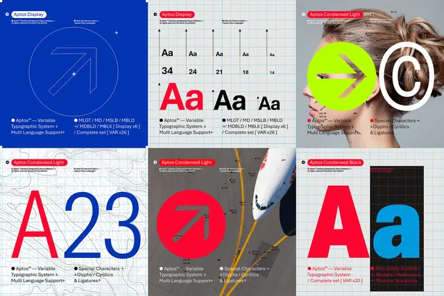
Microsoft is replacing its Calibri default font with Aptos, a new sans-serif typeface that’s inspired by mid-20th-century Swiss typography. Previously known as Bierstadt, Aptos has been part of Microsoft’s hunt for its new default font over the past couple of years. The software giant commissioned five new custom fonts for Office in 2021, and the Aptos font was picked as the default after years of feedback.
“Today we begin the final phase of this major change where Aptos will start appearing as the new default font across Word, Outlook, PowerPoint and Excel for hundreds of millions of users,” explains Si Daniels, a principal program manager at Microsoft, in a design blog post today. “And, over the next few months it will roll out to be the default for all our customers.”
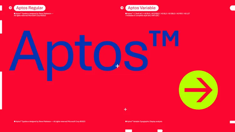
Aptos was created by Steve Matteson, a leading type designer. Matteson previously created Segoe, which was licensed by Microsoft to be used as the Windows default font. Microsoft first started using the Segoe UI font subfamily in Windows Vista, and it’s still used in Windows 11 today. Matteson also worked on the development of the original Windows TrueType core fonts. Bierstadt has been renamed to Aptos after Matteson’s favorite unincorporated town in Santa Cruz, California.
Aptos’ stroke endings are very clearly cut off, but there’s some subtle softening to avoid the rigid grid-based typography you typically find with a font like this. Helvetica is the most famous example of this type of “grotesque san-serif” font, and Matteson has contrasted Microsoft’s Arial font here, too.
The other four fonts that weren’t selected as the default — Grandview, Seaford, Skeena, and Tenorite — will still be available in Office, and Microsoft is even keeping the Bierstadt font name around in the drop-down picker for those who have already become familiar with it.
“Aptos is a part of a broader wave of features coming to Microsoft 365. We’re pushing to make the software more expressive and inclusive,” explains Daniels. “There’s a newly designed font picker experience, along with new themes, colors, and backgrounds.”
By Tom Warren www.theverge.com